|
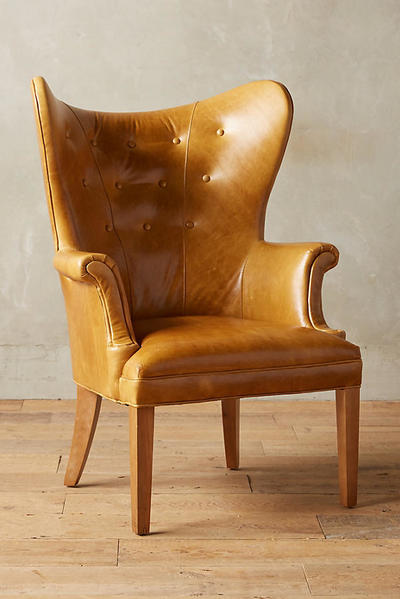
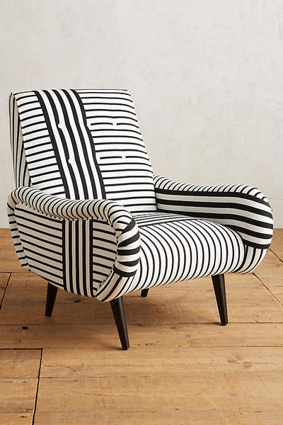
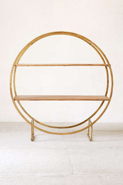
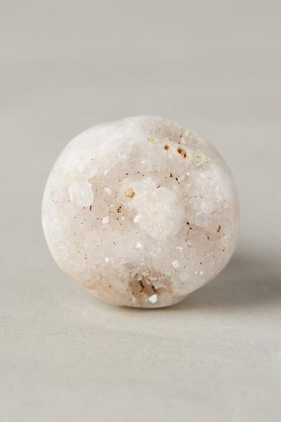
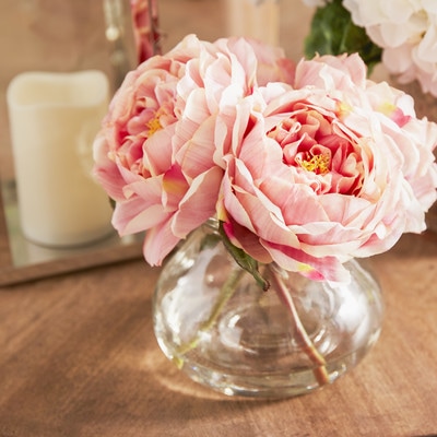
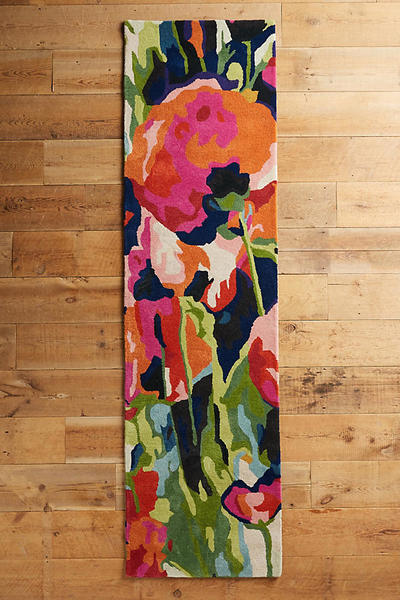
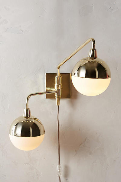
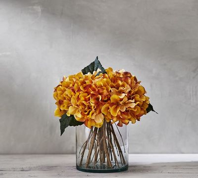
In my next apartment, having a reading nook is non-negotiable. Reading nooks don't have to be complicated; all you really need is a good bookshelf, a few comfy chairs, and a table to hold a warm cup of tea. Though those are the basics of a reading nook, that doesn't mean your space can't also scream style. This weekend, I spent the day in Austin, TX and was inspired by the bright colors and tribal patterns in the boutiques of SoCo and on 2nd street. The color inspiration from the room was solely based on the bold tribal rug chosen. The navy and yellow accents in the room were inspired directly from the pattern in the rug; the wall color was also chosen to complement the mauve-esque color of the rug's background. My goal for this moodboard was to bring unique shapes and patterns into the same room while creating a cohesive and functional space. I think that I was able to achieve that goal by finding a great statement shelf and by pairing two completely different chairs. Curious to see how everything came together? Check it out. Design by Ashley Marino What do you think? My only complaint about the room is that I had trouble finding prettier books to "stack" on the shelf. I then realized that most of the books I own aren't that beautiful. For a space to be livable, style sacrifices may need to be made. (I cringed while writing that sentence, but the statement still stands.) Those sacrifices may include incorporating books that don't have the prettiest of spines into your space because their content outweighs their worn covers. Despite that, I'm super pleased with the way this space turned out. Check out what items I pinned for the board above here: https://www.pinterest.com/misssashleyrose/inspo-board-7/ Check out what I'm working on next week here: https://www.pinterest.com/misssashleyrose/inspo-board-8/
0 Comments
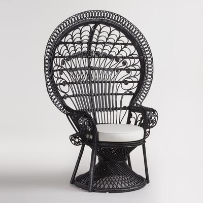
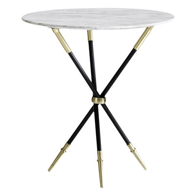
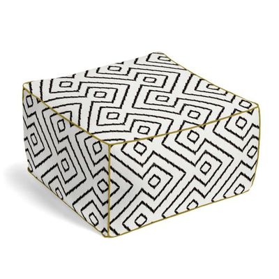
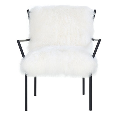
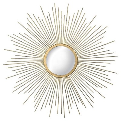
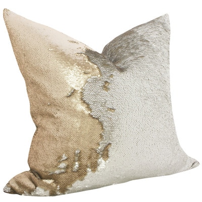
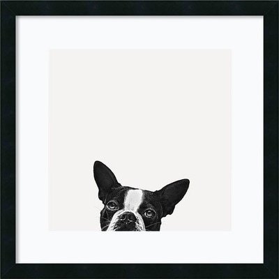
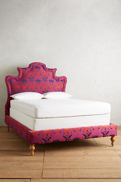
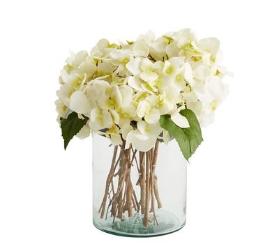
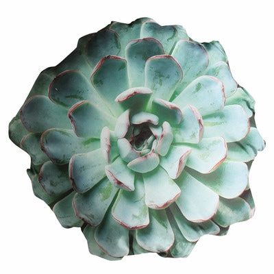
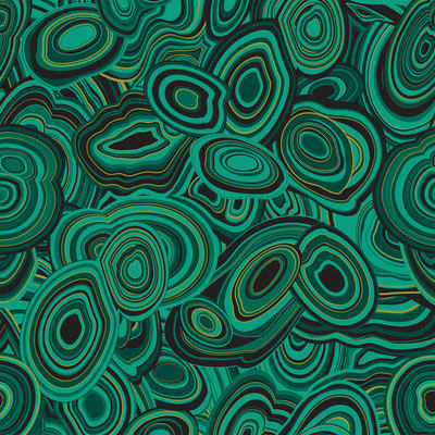
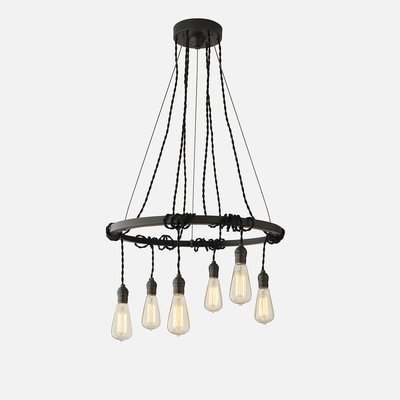
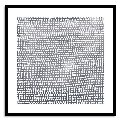
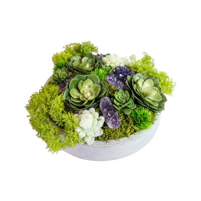
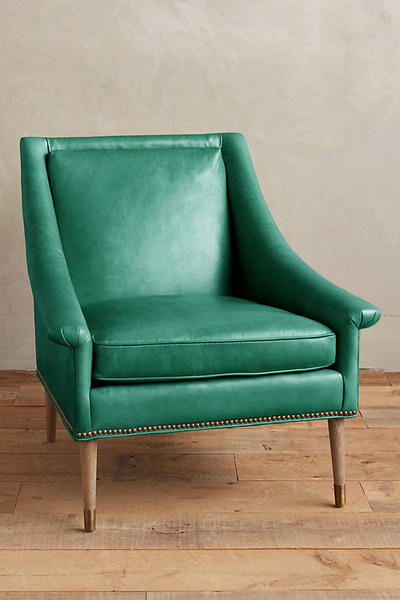
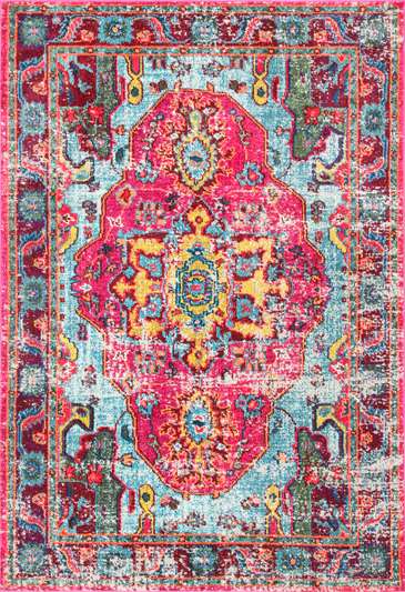
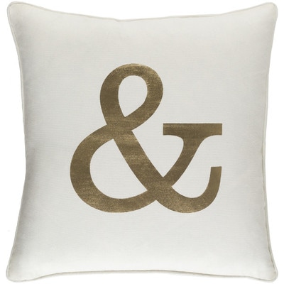
Tribal patterns are all throughout this fun moodboard design. But what happens when tribal meets mid century modern and a touch of 70's? A really really fun moodboard design is the result. Peacock chairs are some of the coolest pieces of furniture out there. If you've ever sat in one, you know just how royal you feel with the chair towering over your head. These chairs transport you to another time in design- they're absolutely lovely. This chair paired with a mid century modern sofa and velvet window treatments gives this room throwback vibes. What really brings this room into the 21st century is the tribal pattern wall tile, a marble drum coffee table, and a seriously bad ass Jonathan Adler end table. While sourcing, I came across a company called Loom Decor and fell in love with their work instantly. The chartreuse pillow and adorable pouf are both from their website, which specializes in custom orders. I would love to use their product for a client because I can tell they know what they're doing when it comes to quality work. That's enough chatter- here's this week's design: Design by: Ashley Marino Was it everything my description above made it out to be? I am really pleased with the outcome of this room and am now a total convert of putting tile on the wall (and not just in the bathroom or kitchen). When I'm able to put real tile on someone's real walls... that's how I know I'll have made it in the design world. Check out the items I sourced for this board: https://www.pinterest.com/misssashleyrose/inspo-board-6/ Check out the items I'm sourcing for next week: https://www.pinterest.com/misssashleyrose/inspo-board-7/ Neutrals can be cool? No way. I wouldn't have thought so either until actually trying my hand at designing a room using only neutrals. When not working with color, the use of different textures is so important to bring interest into a space. Furs, metals, and patterns (though neutral colors) are anything but boring. Some people, like myself, prefer colors to dominate a space. Others may prefer more zen-like environments, which can include the use of a lot of white. This board took me out of my comfort zone for sure, but I am super pleased with the result and am confident that I could make an all-neutral room for a future client. Finally, the moment you've been waiting for - Design by: Ashley Marino Ta-da! What do you think? My personal favorite part of the board is the matching cat and dog prints, which are by two totally different artists but match the same color scheme and style. Actually, my favorite part is the starburst mirror. Actually, it's the sequined throw. Actually, the whole room is amazing and I would be proud to put this in any client's home. Check out what items I sourced: https://www.pinterest.com/misssashleyrose/inspo-board-5/ Check out what I'm working on for next week: https://www.pinterest.com/misssashleyrose/inspo-board-6/ This week we're talking about a bathroom moodboard that has some serious style. As I was researching fixtures for this board, I came across what was called a Columbia bridge faucet. Being new in the industry, I had never heard of this style of faucet before. Now that I have seen the light, I will request that this fixture to be used in every bathroom ever because it is that beautiful (in my humble opinion). The thing that I struggled the most with while creating this board was finding a happy balance between the colors of the tile and the paint. I was originally going to go for something neutral for the walls in order to let the light blue tile shine. Instead, I went the entirely opposite direction and chose Sherwin Williams' Dark Night. If you can imagine the rest of the bathroom in that beautiful dark color, it makes the accent tile POP while adding some needed color to the space. It's a total win-win situation. Ladies and gents- this week's moodboard: Design by: Ashley Marino So, what do you think? Personally, I think that next week's moodboard for sure will not have tile in it because that takes forever to photoshop small sections of tile into what you see above. This editing drained me, but honestly the result was totally worth it. Seeing my hard work come together at the end of the week makes Mondays that much better. Maybe two weeks from now, you'll see a board with some beautiful patterned tile flooring (I've been getting major inspo from sources like Cle Tile and Popham Design). Check out the sources that I used for this week's design here: https://www.pinterest.com/misssashleyrose/inspo-board-4/ Keep up to date on what I'm pinning for next week's moodboard here: https://www.pinterest.com/misssashleyrose/inspo-board-5/ This week, there was a challenge in store for me. This challenge wasn't like last week's where I chose two colors and made something uniquely beautiful out of it. Rather, I took on the task of designing a room that I never tried designing before. Welcome to my first bedroom moodboard. If you haven't realized this yet from looking at my last two designs, I'm kind of in love with the idea of plants in homes. Adding greenery is a great way to bring some of the soothing effects of nature into an interior space. This week, I went a tiny bit overboard on the amount of greenery that I used, but I feel like it makes the reading nook in the bedroom a great and calming place to relax before bed. I found the succulent pillow above while sourcing last week and knew that I needed to use it soon. The combination of plants on the bookshelf (both green and brass) along with the succulent pillow ties the theme together nicely. This bed frame and headboard combo was the first item that I sourced for this week; the pink, navy, and orange sung to me. Though these colors aren't usually the ones that I tend to gravitate toward, this piece was beautiful enough to base the colors in the room around. Because I chose to have patterns in the rug, bed frame, and headboard, it was an easy choice to keep the bedding and curtains simple as to not draw too much attention from the main colors in the room. The accent pieces in the room are all antique brass or wood. The greige flooring and white brick walls made a great neutral canvas to help showcase the bold colors chosen for this room. Tired of me talking about how beautiful this room is yet? Well, this is the board you've been looking for: Design by: Ashley Marino All I have left to say is that my boxes are packed up and I'm ready to move in. Stay tuned for next week's mood board for more original designs by yours truly. Check out what products I sourced here: https://www.pinterest.com/misssashleyrose/inspo-board-3/ See what progress I'm making on next week's mood board here: https://www.pinterest.com/misssashleyrose/inspo-board-4/ This moodboard was not easy to finish. I started this board immediately after completing the first one, thinking that it would be easy to keep myself on a roll. Little did I know at that time, about halfway through the week I would have created an Addams family-esque nightmare. It at one point kind of looked like the Hulk designed a room from the Middle Ages and it was a mess. I took a few days off, took a step back, and went back to work. I'm so happy with the result because it turned out being something totally out of my comfort zone and something that I would have never thought of designing for myself. (I'm pretty sure if I'm working in this industry, I need to adapt my tastes for clients so this is probably good practice.) A not so subtle obsession of mine is succulents; I took the succulent arrangement above and thought- how could I bring these elements into a cohesive space? A rich room with greens, purples, and neutrals was the result. Here it is: Design by: Ashley Marino I am pleased. Maybe next week I'll cruise back on into my comfort zone because this green and purple combo took me way out there. Knowing myself, probably I'll come up with an even larger challenge for next week. Keep updated with what I'm creating and follow my design boards on Pinterest. Here's the board for this week's project: www.pinterest.com/misssashleyrose/inspo-board-2/ And here's the board for next week: www.pinterest.com/misssashleyrose/inspo-board-3/ As far as my first attempt at a moodboard for my portfolio, I feel like this room accurately represents myself as a person. I enjoyed creating this room much more than I originally thought I would and doing so didn't feel like work at all. (I think that's a really good sign for the future). This design was based entirely on the rug above after I fell in love with it. The bright colors in the rug sung to me, so it was practically begging to be sourced. Though there wasn't much green in the rug, the anthropologie arm chair inspired me; I realized that bringing sea foam into the mix was necessary to complete this fun space. To pack a final punch of personality, adding flowers, succulents, and an ampersand tied everything together nicely. So without further ado, I present to you the first of many moodboards I will be creating: Design by: Ashley Marino What do you think? I'm stoked for the future and am looking forward to keeping up my creative juices in 2017. I can't wait to compare this moodboard with the one I create at the end of the year to this one to see how much I've progressed.
Check out where I sourced all of the products for the image above: https://www.pinterest.com/misssashleyrose/inspo-board-1/ Also, check out the progress I'm making on my next moodboard: https://www.pinterest.com/misssashleyrose/inspo-board-2/ |
the blogHere's where you can come to get your weekly dose of design inspo. Every Monday, there will be a blog post with an original Ashley Marino Designs moodboard, trade-only tips, or ways to help you get the space that you're dreaming of. Enjoy! Archives
January 2018
|

 RSS Feed
